Visualizing Survival Data with the {ggsurvfit} R Package
Authors
Daniel D. Sjoberg

![]()
Senior Principal Data Scientist at Genentech.
Previously, a Lead Data Science Manager at the Prostate Cancer Clinical Trials Consortium, and a Senior Biostatistician at Memorial Sloan Kettering Cancer Center in New York City.
He enjoys R package development, creating many packages available on CRAN, R-Universe, and GitHub.
Winner of the 2021 American Statistical Association (ASA) Innovation in Statistical Programming and Analytics award.
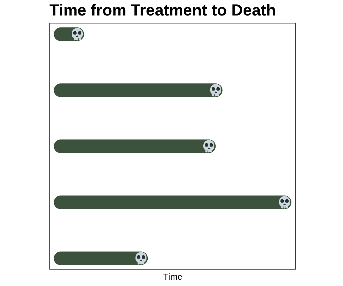
Survival Analysis, Censoring
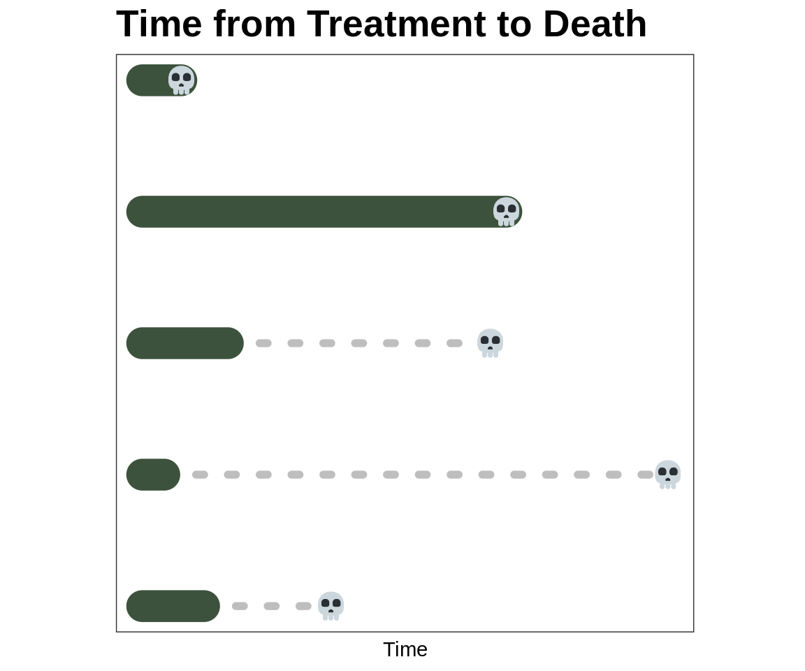
The skulls are the time when each of these patients die
We observe the follow-up in the solid line
The dashed line is unobserved
How can we summarize the average time from treatment to death?
Why {ggsurvfit} ?
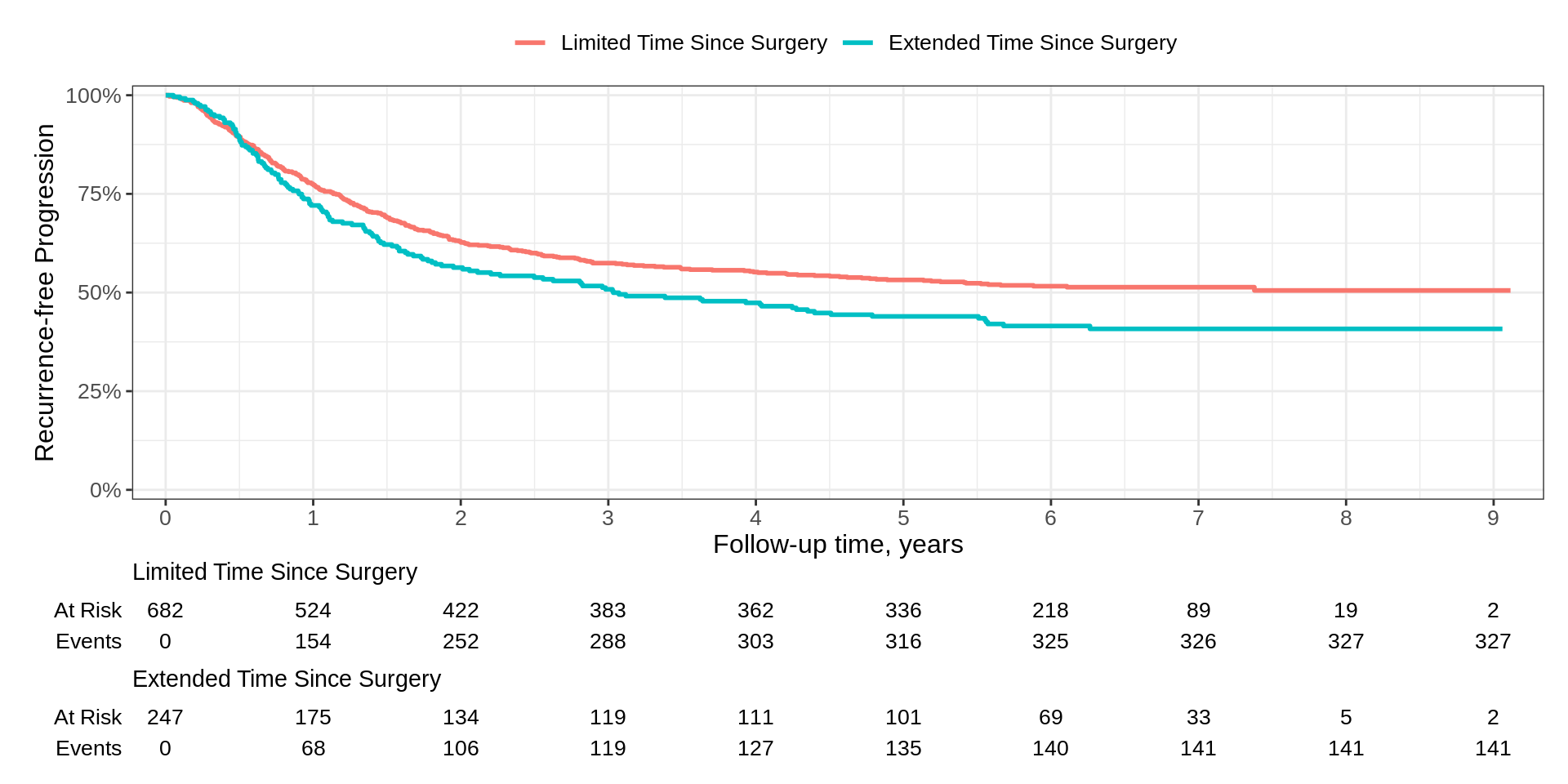
Basic Example

- The Good
- Simple code and figure is nearly publishable
- Risk table with both no. at risk and events easily added
- x-axis label taken from the
timecolumn label - Can use ggplot2
+notation
- The Could-Be-Better
- y-axis label is incorrect, and the range of axis is best at 0-100%
- Axis padding a bit more than I prefer for a KM figure
- x-axis typically has more tick marks for KM figure
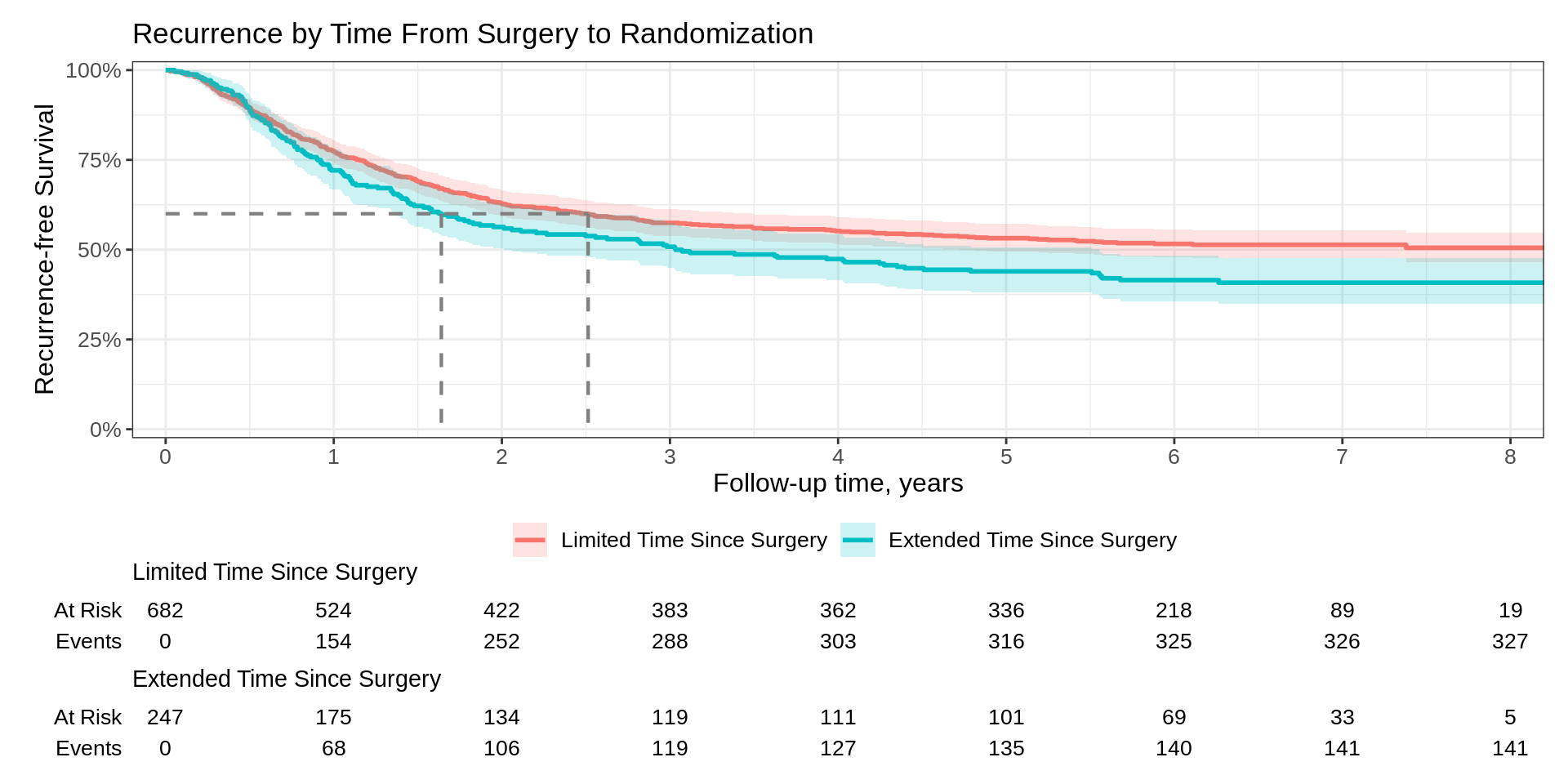
Basic Example
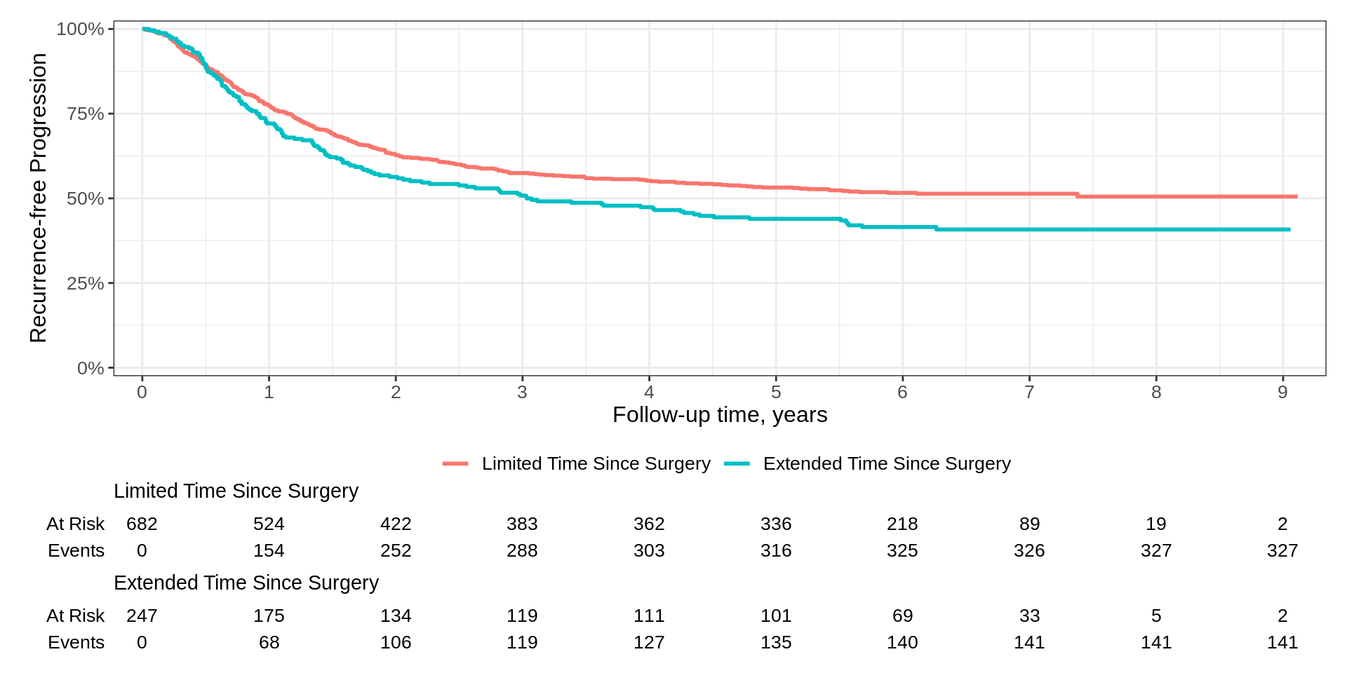
Padding has been reduced and curves begin in the upper left corner of plot
x-axis reports additional time points (and as a result, the risk table as well)
We updated the y-axis label weaving standard ggplot2 functions
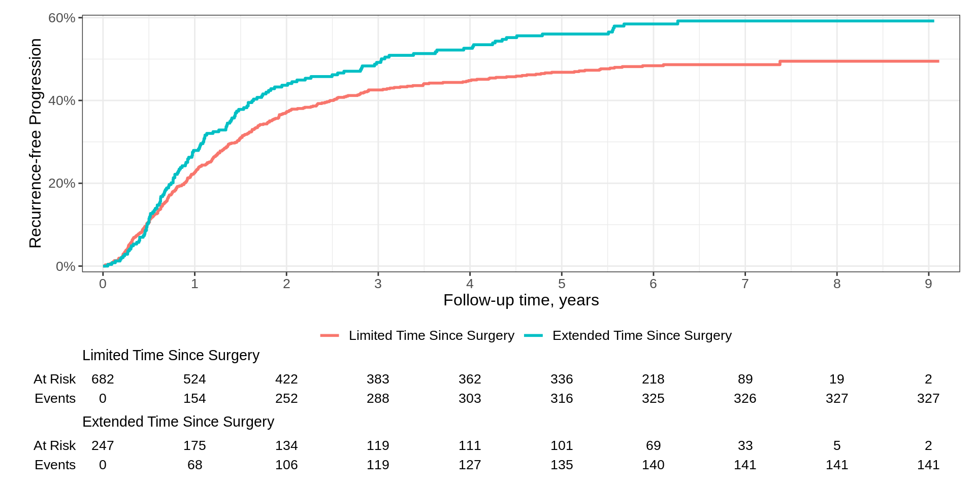
Basic Example
Padding has been reduced and curves begin in the upper left corner of plot
x-axis reports additional time points (and as a result, the risk table as well)
We updated the y-axis label weaving standard ggplot2 functions
We can even use ggplot2-extender functions
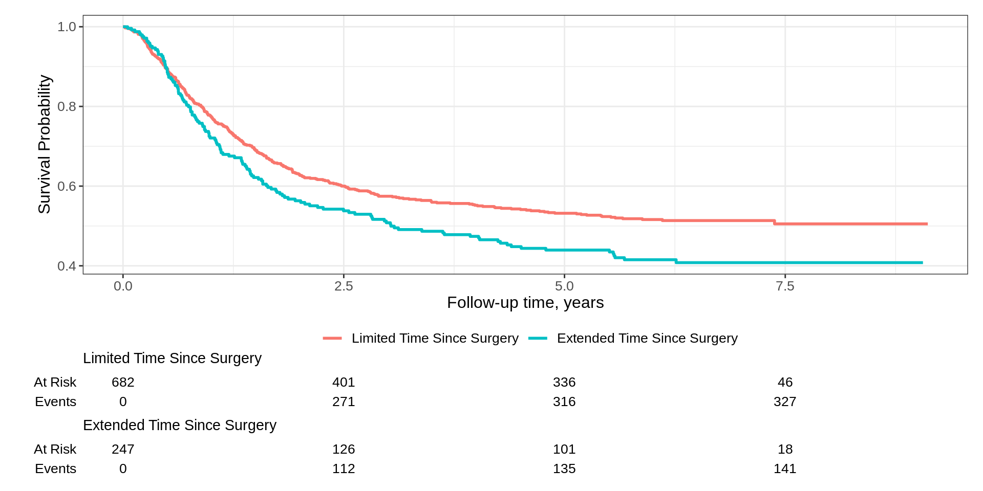
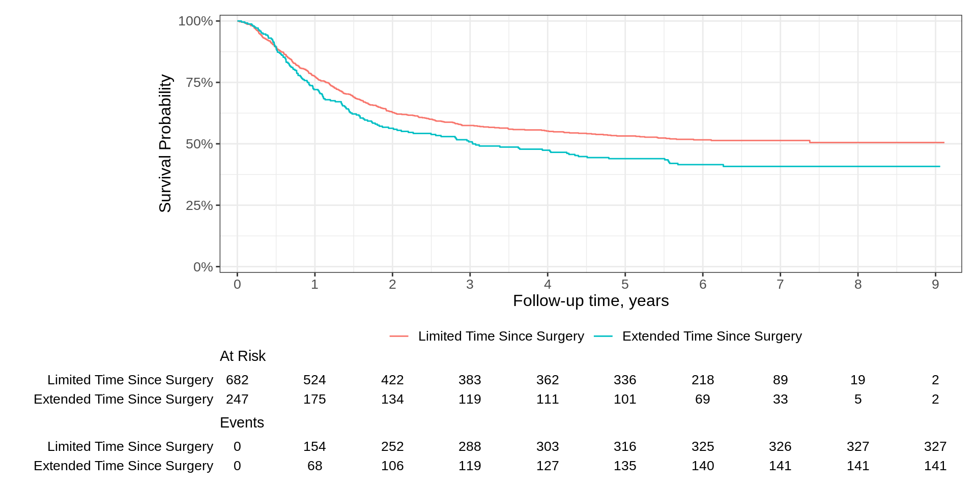
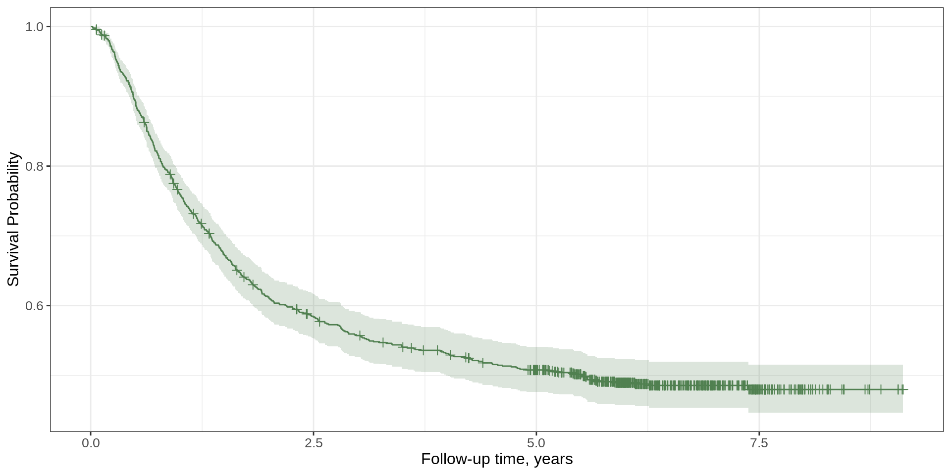
Basic Example, transformation
{ggsurvfit} defaults

{ggplot2} styled

{ggsurvfit} defaults
Group by statistic or strata
Color encoding strata

Customizing the risktable statistics

Median summary
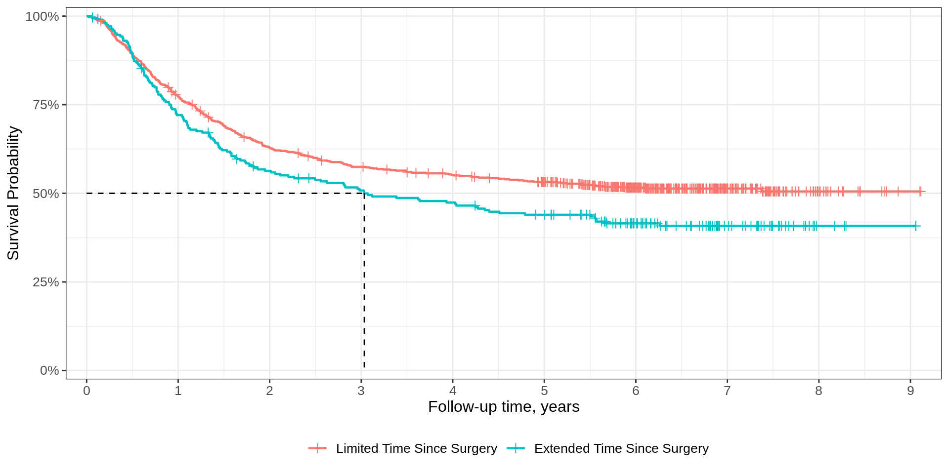
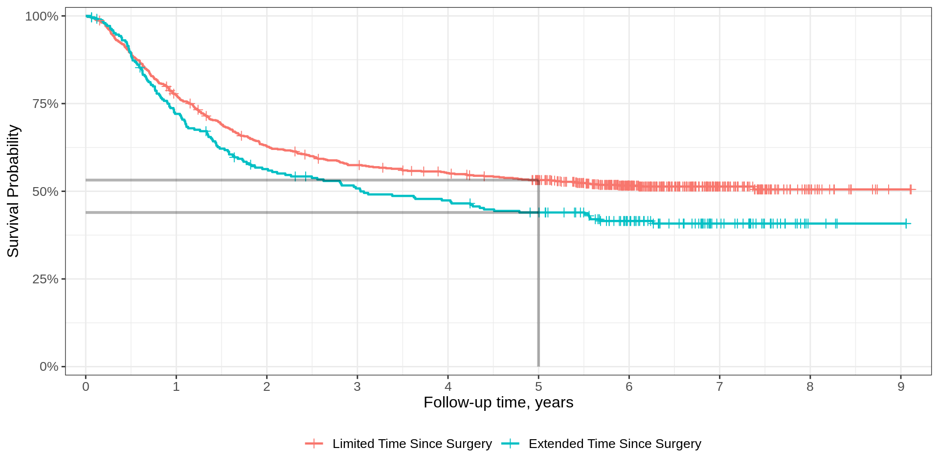
At a given timepoint
Underyling {ggsurvfit} functions
In addition to using additional {ggplot2} functions, it is helpful to understand which underlying functions are used to create the figures.
Additional arguments can be passed to the underlying functions.
| {ggsurvfit} | Underlying {ggplot2} |
|---|---|
|
|
|
|
|
|
|
|
Further Risktable Customization

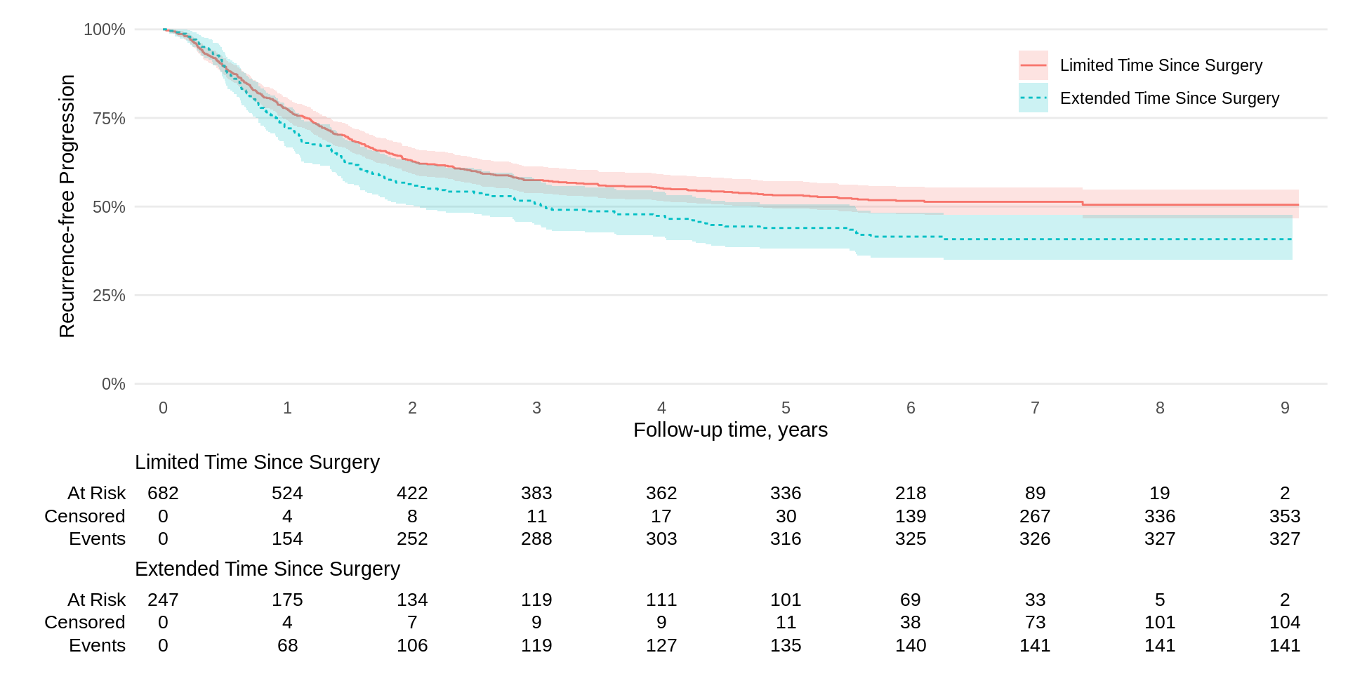
Another Example
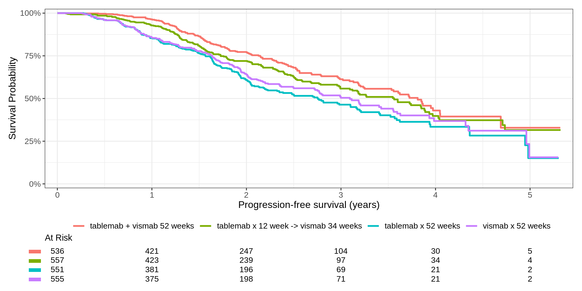
KMunicate
CDISC ADaM ADTTE
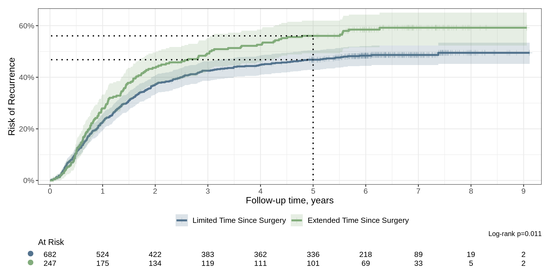
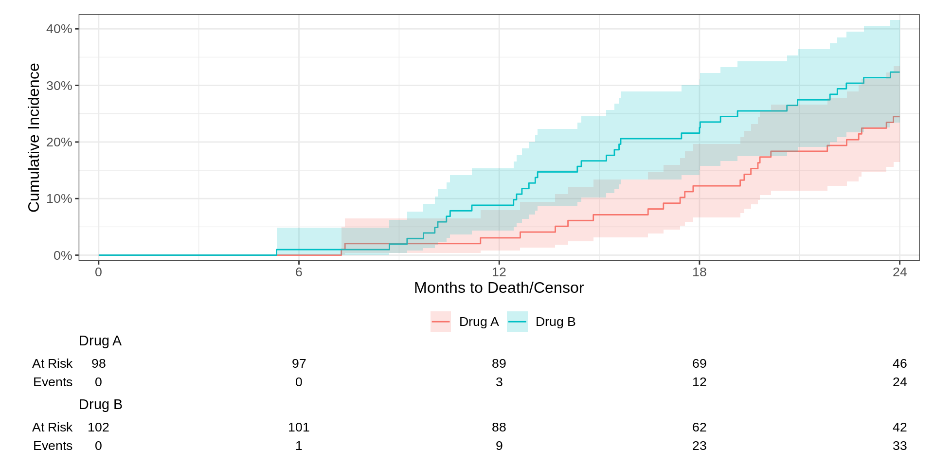
Competing Risks
Side-by-Side
p <- survfit2(Surv(time, status) ~ 1, df_colon) %>%
  ggsurvfit() +
  add_confidence_interval() +
  add_risktable() +
  scale_ggsurvfit()

# build plot (which constructs the risktable)
built_p <- ggsurvfit_build(p) |> patchwork::wrap_plots()

# I am hoping in the future was can just call `p | p`
built_p | built_p 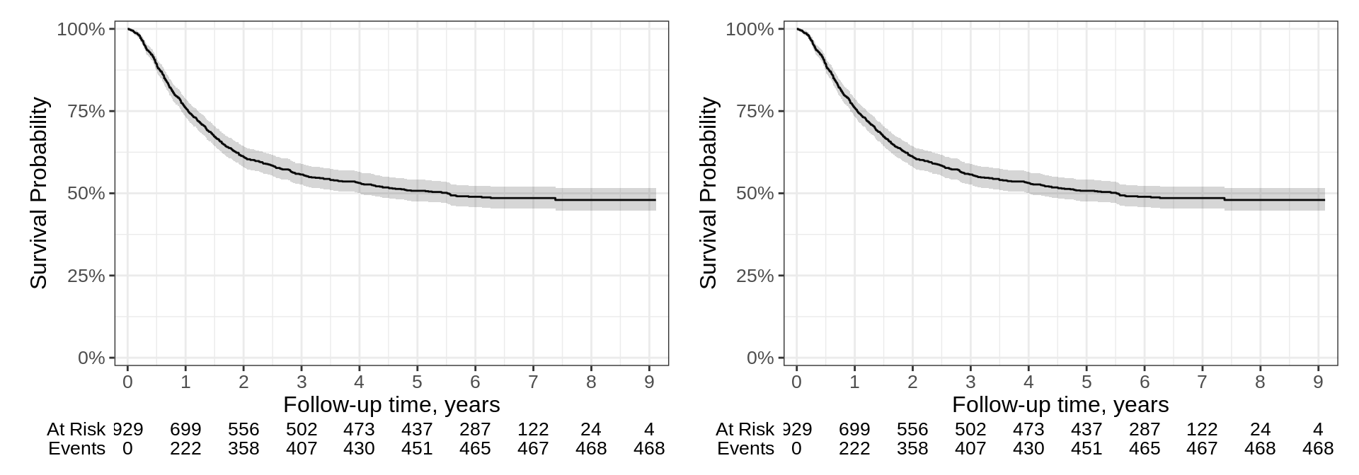
{ggsurvfit} wrap up
Ease the creation of time-to-event summary figures with ggplot2
Concise and modular code
Ready for publication or sharing figures
Sensible defaults
Also supports competing risks cumulative incidence summaries
![]()