Plot DCA Object with ggplot
Arguments
- x
dca object created with
dca()- type
indicates type of plot to produce. Must be one of
c("net_benefit", "net_intervention_avoided", "standardized_net_benefit"). The default is"net_benefit", unless the net intervention has been calculated when"net_intervention_avoided"is used, or if"standardized_net_benefit"has been calculated.- smooth
Logical indicator whether plot will be smooth with
ggplot2::stat_smooth(). Default isFALSE- span
when
smooth = TRUE, Controls the amount of smoothing for loess smoother. Smaller numbers produce wigglier lines, larger numbers produce smoother lines. Default is0.2.- style
Must be one of
c("color", "bw"). Default is"color", and"bw"will print a black and white figure- show_ggplot_code
Logical indicating whether to print ggplot2 code used to create figure. Default is
FALSE. Set toTRUEto perform advanced figure customization- ...
not used
Value
a ggplot2 object
Examples
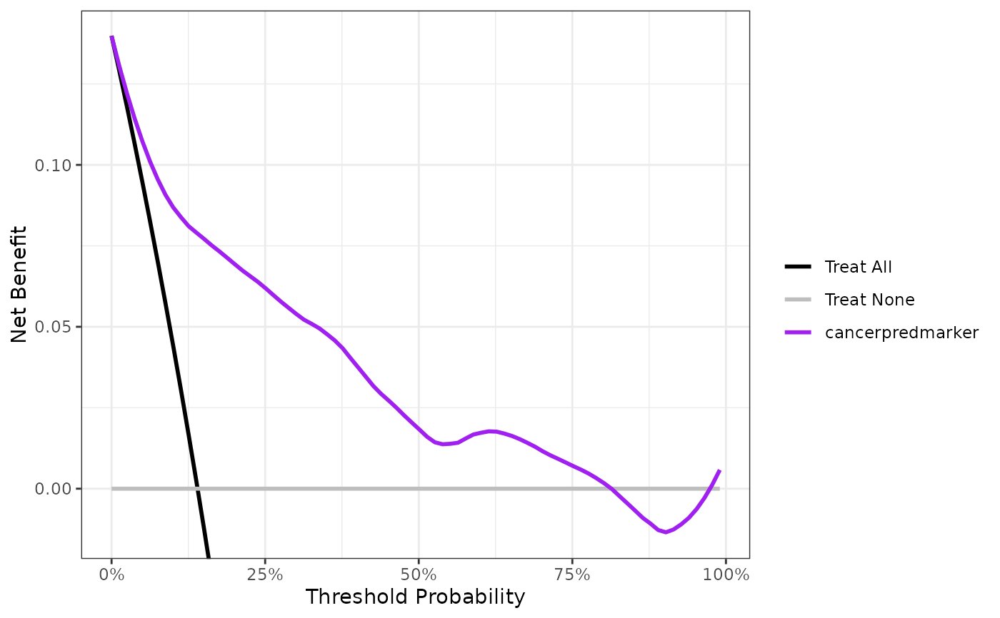
p <-
  dca(cancer ~ cancerpredmarker, data = df_binary) %>%
  plot(smooth = TRUE, show_ggplot_code = TRUE)
#> # ggplot2 code to create DCA figure -------------------------------
#> as_tibble(x) %>%
#>   dplyr::filter(!is.na(net_benefit)) %>%
#>   ggplot(aes(x = threshold, y = net_benefit, color = label)) +
#>   stat_smooth(method = "loess", se = FALSE, formula = "y ~ x",
#>     span = 0.2) +
#>   coord_cartesian(ylim = c(-0.014, 0.14)) +
#>   scale_x_continuous(labels = scales::percent_format(accuracy = 1)) +
#>   labs(x = "Threshold Probability", y = "Net Benefit", color = "") +
#>   theme_bw()
p


# change the line colors
p + ggplot2::scale_color_manual(values = c('black', 'grey', 'purple'))
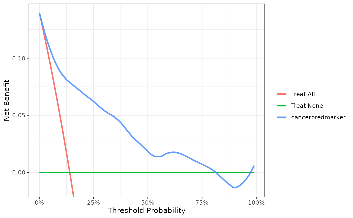
# change the line colors
p + ggplot2::scale_color_manual(values = c('black', 'grey', 'purple'))