The gallery exhibits both default plots as well as the many modifications one can make.
Modifications with ggplot2
Let’s begin with showing the default plot and common modifications that are made with ggplot2 functions.
- Expand axis to show percentages from 0% to 100%
- Limit plot to show up to 8 years of follow-up
- Add the percent sign to the y-axis label
- Reduce padding in the plot area around the curves
- Add additional tick marks on the x-axis
- Update color of the lines
- Using the ggplot2 minimal theme
gg_default <-
  survfit2(Surv(time, status) ~ surg, data = df_colon) %>%
  ggsurvfit() +
  add_confidence_interval() +
  scale_ggsurvfit() +
  labs(title = "Default")

gg_styled <-
  gg_default +
  coord_cartesian(xlim = c(0, 8)) +
  scale_color_manual(values = c('#54738E', '#82AC7C')) +
  scale_fill_manual(values = c('#54738E', '#82AC7C')) +
  theme_minimal() +
  theme(legend.position = "bottom") +
  guides(color = guide_legend(ncol = 1)) +
  labs(
    title = "Modified",
    y = "Percentage Survival"
  )

gg_default + gg_styled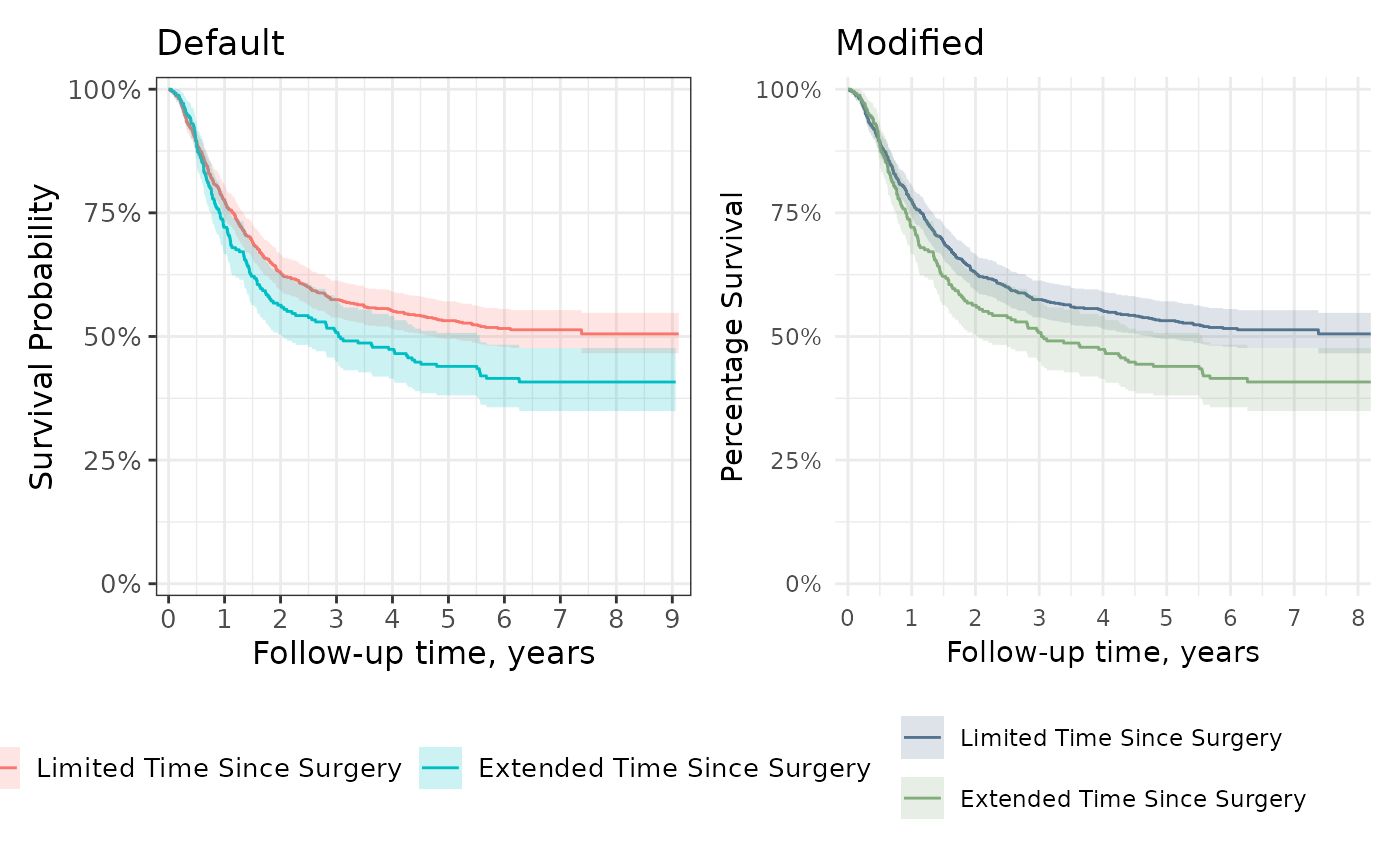
In addition to using additional {ggplot2} functions, it is helpful to
understand which underlying functions are used to create the figures.
The survival lines are drawn with geom_step() and the
confidence interval with geom_ribbon(). Users can pass
additional arguments to these construction functions in
ggsurvfti(...) and
add_confidence_interval(...), respectively. In the example
below, we use the color and fill aesthetic to change the colors of an
unstratified estimate.
survfit2(Surv(time, status) ~ 1, data = df_colon) %>%
  ggsurvfit(color = "#508050") +
  add_confidence_interval(fill = "#508050") +
  add_risktable() +
  scale_ggsurvfit()
Risk Tables
The default risk table styling is ready for publication.
survfit2(Surv(time, status) ~ surg, data = df_colon) %>%
  ggsurvfit() +
  add_confidence_interval() +
  add_risktable() +
  scale_ggsurvfit()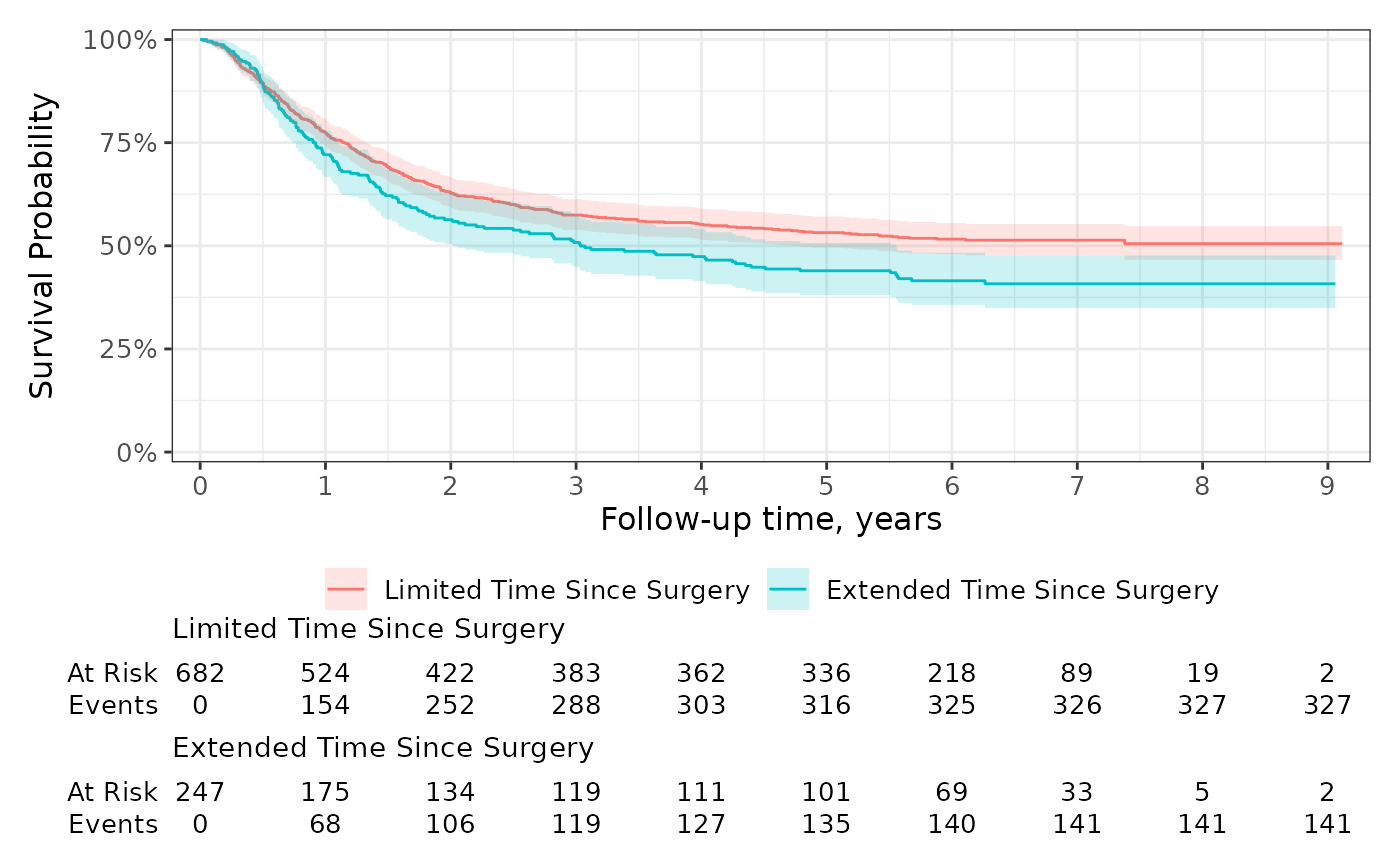
You can also group the risk table by the statistics rather than the stratum. Let’s also add additional time points where the statistics are reported and extend the y axis.
ggrisktable <-
  survfit2(Surv(time, status) ~ surg, data = df_colon) %>%
  ggsurvfit() +
  add_confidence_interval() +
  add_risktable(risktable_group = "risktable_stats") +
  scale_ggsurvfit()
ggrisktable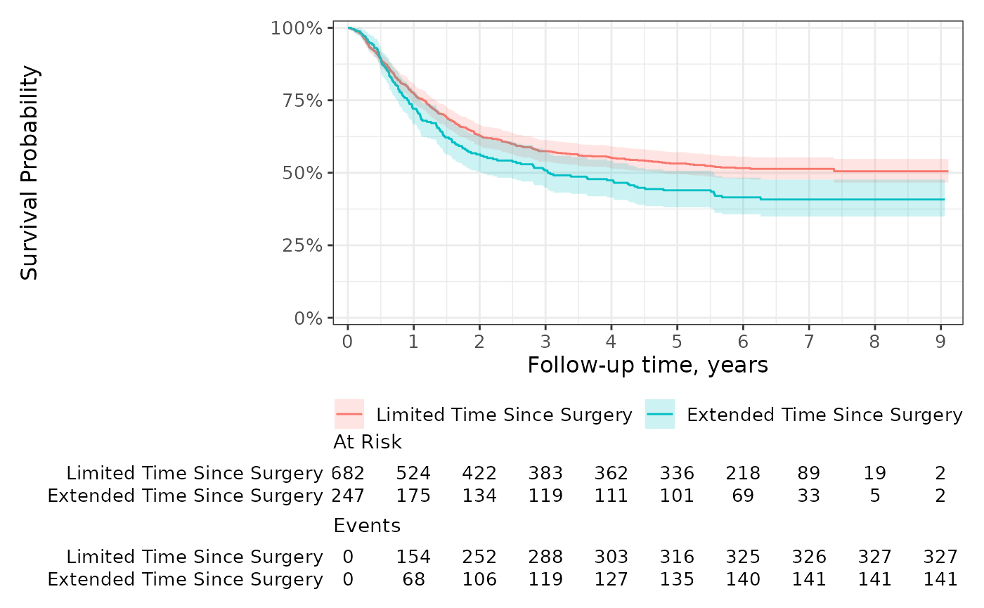
Use add_risktable_strata_symbol() to replace long
stratum labels with a color symbol. The default symbol is a colored
rectangle and you can change it to any UTF-8 symbol or text string. In
the example below, we’ve updated the symbol to a circle.
ggrisktable +
  add_risktable_strata_symbol(symbol = "\U25CF", size = 10)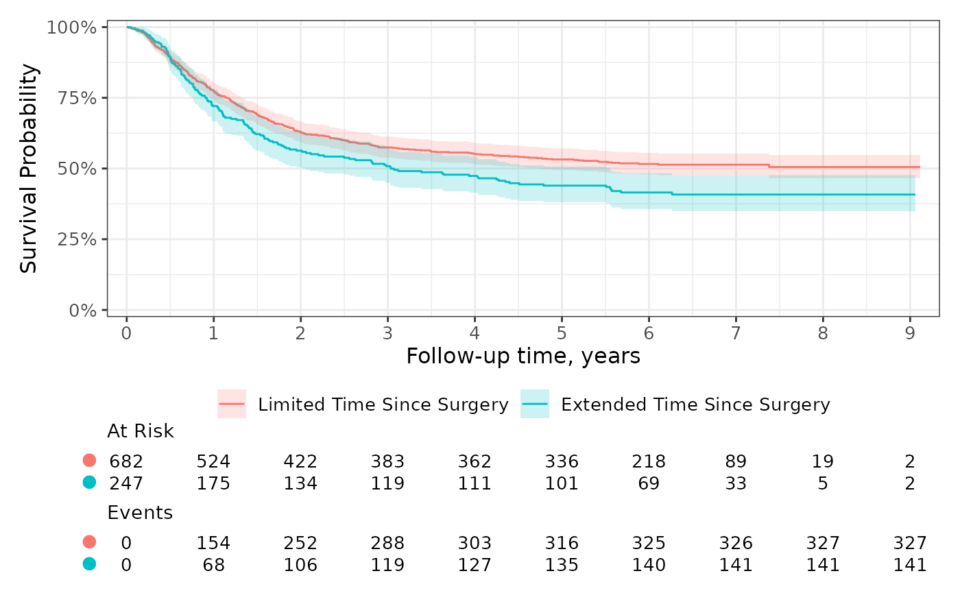
You can further customize the risk table using themes and the
add_risktable(...) arguments. For example, use the
following code to increase the font size of both the risk table text and
the y-axis label.
survfit2(Surv(time, status) ~ surg, data = df_colon) %>%
  ggsurvfit(linewidth = 0.8) +
  add_risktable(
    risktable_height = 0.33,
    size = 4, # increase font size of risk table statistics
    theme =   # increase font size of risk table title and y-axis label
      list(
        theme_risktable_default(axis.text.y.size = 11,
                                plot.title.size = 11),
        theme(plot.title = element_text(face = "bold"))
      )
  ) +
  scale_ggsurvfit()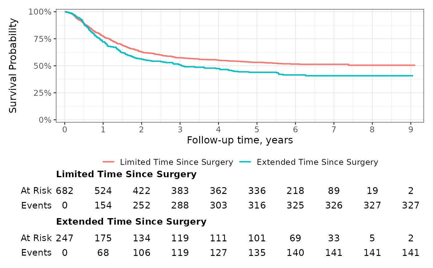
You can also use glue-like syntax to place multiple statistics on the same row of the risk table.
survfit2(Surv(time, status) ~ sex, data = df_lung) %>%
  ggsurvfit() +
  add_risktable(risktable_stats = "{n.risk} ({cum.event})") +
  scale_ggsurvfit()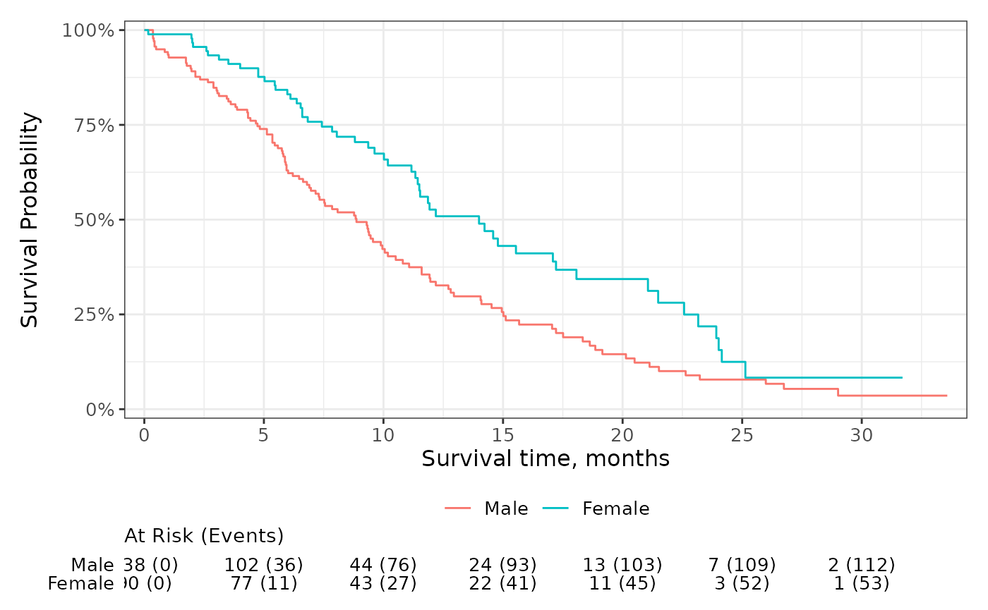
Quantiles and Censor Markings
Add guidelines for survival quantiles and markings for censored
patients using add_quantile() and
add_censor_mark(). The add_quantile() function
allows users to place guidelines by specifying either the y-intercept or
x-intercept where the lines shall originate.
survfit2(Surv(time, status) ~ surg, data = df_colon) %>%
  ggsurvfit(linewidth = 0.8) +
  add_censor_mark(size = 2, alpha = 0.2) +
  add_quantile(y_value = 0.5, linetype = "dotted", color = "grey30", linewidth = 0.8) +
  add_quantile(x_value = 5,  color = "grey30", linewidth = 0.8) +
  scale_ggsurvfit()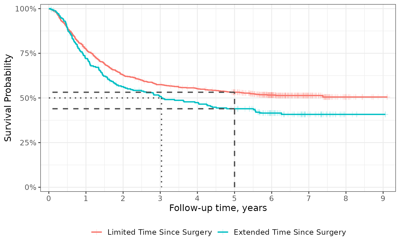
Side-by-Side
One of my favorite features of the {ggsurvfit} package is that any {ggplot2} function may be used to modify the plot and the risk tables will still align with the primary plot. This is accomplished by delaying the construction of the risk tables until the plot is printed.
Because the the delayed build of the risk tables, we must take one
additional step when placing figures side-by-side that contain risk
tables: we must use the ggsurvfit_build() function. This
function will construct the risk tables and combine them with the
primary plot. Once the plots are built, the can be placed side-by-side
with {patchwork} or {cowplot}.
p <-
  survfit2(Surv(time, status) ~ 1, df_colon) %>%
  ggsurvfit() +
  add_confidence_interval() +
  add_risktable() +
  scale_ggsurvfit()

# build plot (which constructs the risktable)
built_p <- ggsurvfit_build(p)
patchwork
Combine with patchwork::wrap_plots()
wrap_plots(built_p, built_p, ncol = 2)To use patchwork plot arithmetic, each plot must be wrapped in
patchwork::wrap_elements()
wrap_elements(built_p) | wrap_elements(built_p)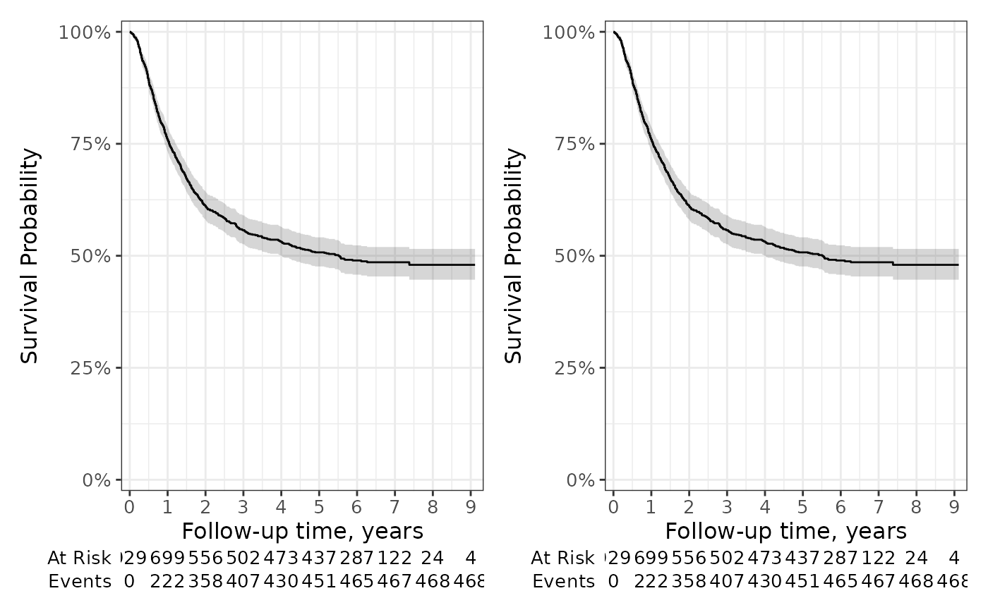
P-values
Compare curves among the stratum using the add_p()
function. P-values can be placed either in the figure caption (the
default) or in the plot area as an annotation.
p <- survfit2(Surv(time, status) ~ surg, data = df_colon) %>%
  ggsurvfit() +
  scale_ggsurvfit()

# place p-value in caption
p1 <- p + add_pvalue(caption = "Log-rank {p.value}")

# place p-value as a plot annotation
p2 <- p + add_pvalue(location  = "annotation", x = 8.5)

p1 + p2 +
  patchwork::plot_layout(guides = "collect") &
  theme(legend.position = "bottom")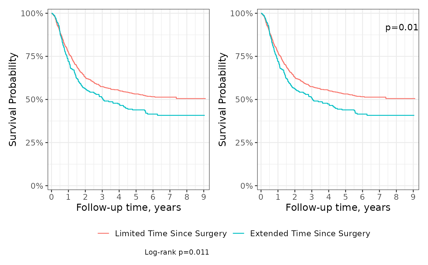
Scales
Unlike most {ggplot2} functions, scales are not additive. This means
that if a scale attribute is modified in one call to
scale_x_continuous(), a second call to
scale_x_continuous() will write over all changes
made in the first. For this reason, the ggsurvfit() and
ggcuminc() functions do not modify the default {ggplot2}
scales; rather, all changes to the scales are left to the user. But, we
do export a helpful ggsurvfit-specific scales function to help.
The scale_ggsurvfit() function will apply default scales
often seen in survival figures: reduced plot padding, y-axis labels
appear as percentages, survival curves are shown from 0% to 100% on the
y-axis. In the example below, we utilize scale_ggsurvfit()
and make other scale changes to the scales, such as, specifying the
breaks on the x-axis.
survfit2(Surv(time, status) ~ surg, data = df_colon) %>%
  ggsurvfit(linewidth = 1) +
  add_confidence_interval() +
  scale_ggsurvfit(x_scales = list(breaks = 0:9))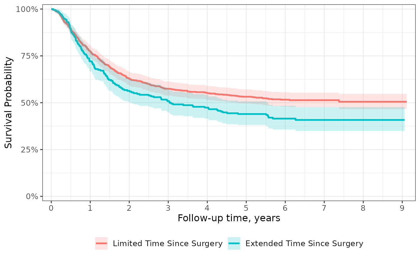
Transformations
Show the probability of an event rather than the probability of being free from the event with transformations. Custom transformations are also available.
p <-
  survfit2(Surv(time, status) ~ surg, data = df_colon) %>%
  ggsurvfit(type = "risk", linewidth = 0.8) +
  add_confidence_interval() +
  scale_ggsurvfit()
p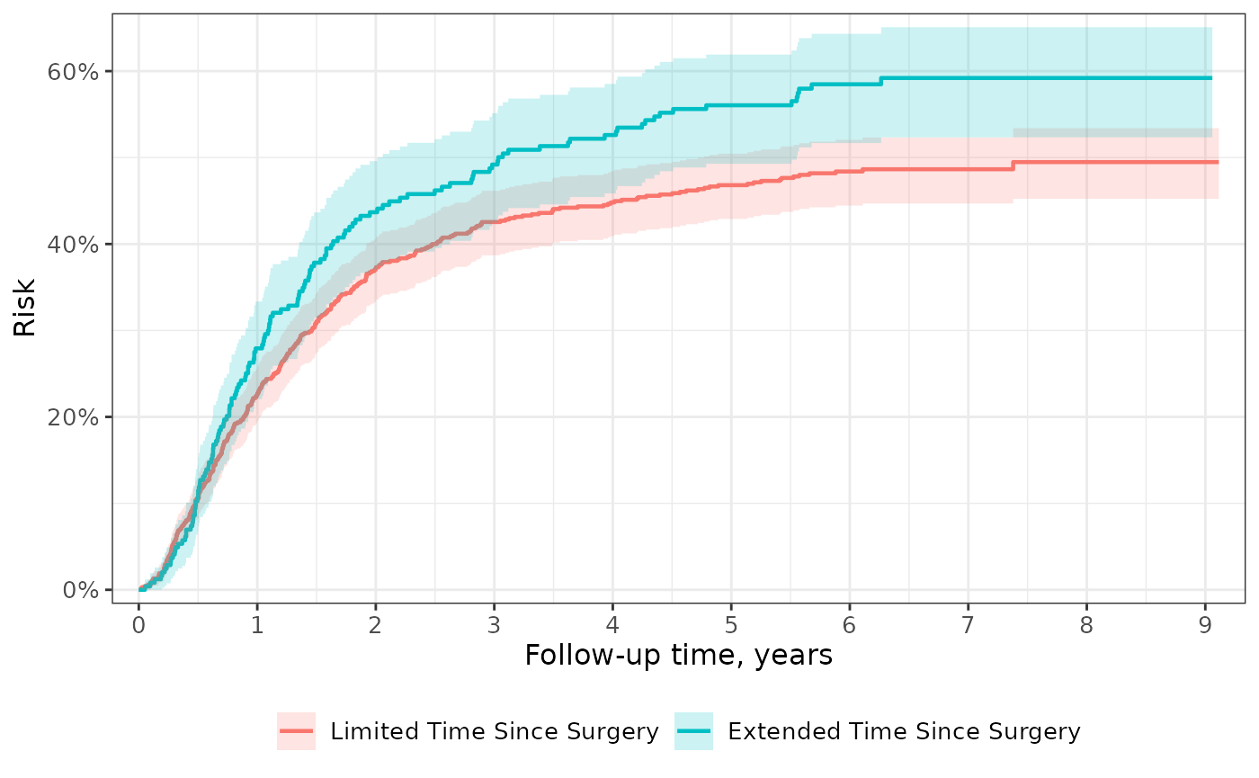
Saving Plots
The {ggsurvfit} package plays well with
ggplot2::ggsave(), which allows you to specify the output
file format, the DPI, the height and width of a the image, and more.
Extensions
Because {ggsurvfit} functions are written as proper {ggplot2} geoms, you can both weave any {ggplot2} functions and ggplot2 extensions, such as {gghighlight} and {ggeasy}.
survfit2(Surv(time, status) ~ rx, data = df_colon) %>%
  ggsurvfit(linewidth = 1) +
  scale_ggsurvfit() +
  gghighlight::gghighlight(
    strata == "Levamisole+5-FU",
    calculate_per_facet = TRUE
  ) +
  ggeasy::easy_remove_legend() +
  ggeasy::easy_y_axis_labels_size(size = 15) +
  ggeasy::easy_x_axis_labels_size(size = 15) +
  ggeasy::easy_y_axis_title_size(size = 15) +
  ggeasy::easy_x_axis_title_size(size = 15)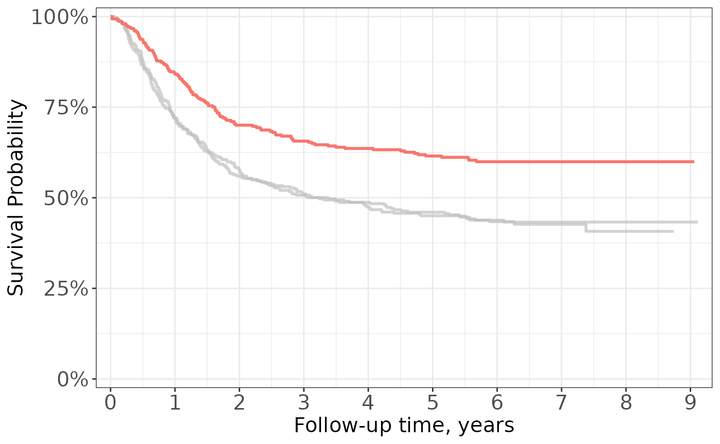
Faceting
Curves created with {ggsurvfit} can also later be faceted using {ggplot2}. Note, however, that faceted curves cannot include a risk table.
The ggsurvfit() function calls
tidy_survfit() to create the data frame that is used to
create the figure. In the data frame, there is a column named
"strata", which we will facet over.
survfit2(Surv(time, status) ~ surg, data = df_colon) %>%
  ggsurvfit() +
  add_confidence_interval() +
  facet_wrap(~strata, nrow = 1) +
  theme(legend.position = "none") +
  scale_x_continuous(n.breaks = 6) +
  labs(title = "PFS by Duration between Surgery and Treatment")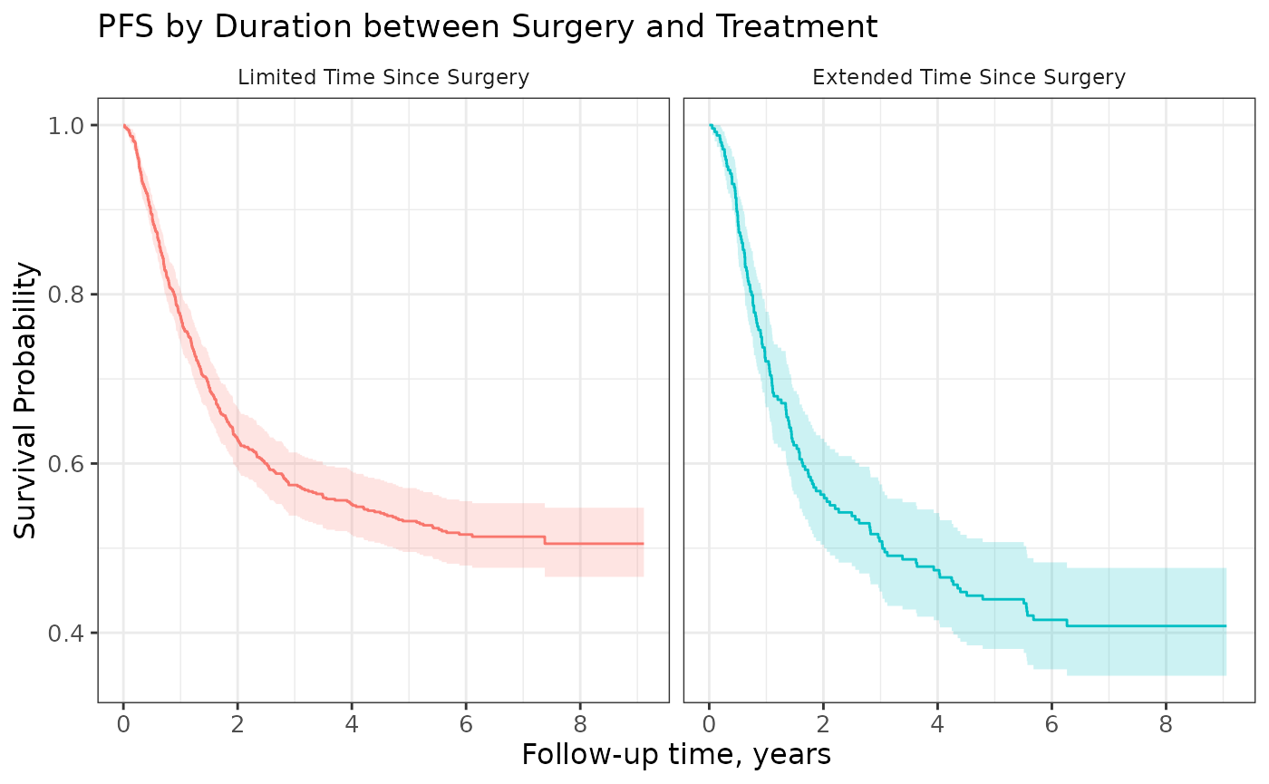
Grey-scale Figures
You may need a black and white figure and that is achieved using grey-scale ggplot2 functions.
survfit2(Surv(time, status) ~ surg, data = df_colon) %>%
  ggsurvfit() +
  add_confidence_interval() +
  scale_color_grey() +
  scale_fill_grey() +
  labs(title = "Grey Scale")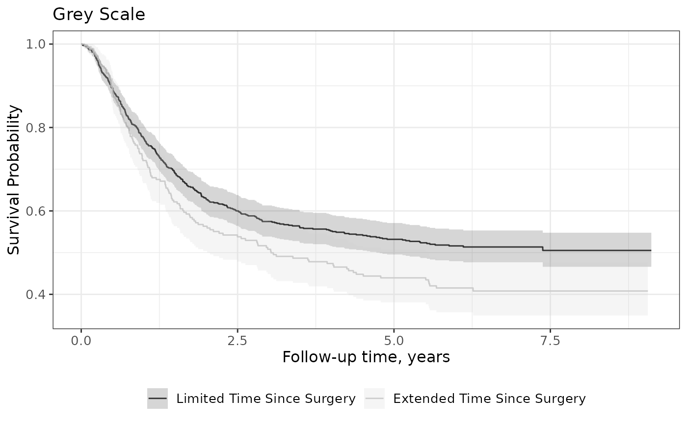
KMunicate
To get figures that align with the guidelines outlined in “Proposals on
Kaplan–Meier plots in medical research and a survey of stakeholder
views: KMunicate.”, use the theme_ggsurvfit_KMunicate()
theme along with these function options.
survfit2(Surv(time, status) ~ surg, data = df_colon) %>%
  ggsurvfit(linetype_aes = TRUE) +
  add_confidence_interval() +
  add_risktable(
    risktable_stats = c("n.risk", "cum.censor", "cum.event")
  ) +
  theme_ggsurvfit_KMunicate() +
  scale_y_continuous(limits = c(0, 1)) +
  scale_x_continuous(expand = c(0.02, 0)) +
  theme(legend.position="inside", legend.position.inside = c(0.85, 0.85))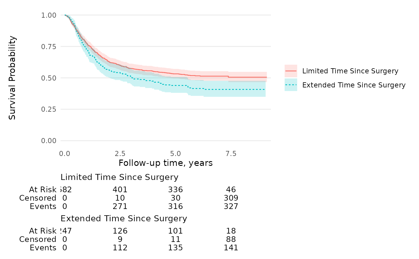
Combining Multiple Survival Endpoints
To display multiple survival endpoints (e.g., Overall Survival and Progression-Free Survival) on the same plot, stack your data so each patient has multiple rows—one for each endpoint.
# Create stacked data with multiple endpoints
stacked_adtte <-
  adtte %>%
  dplyr::select(USUBJID, PARAM, AVAL, CNSR) %>%
  dplyr::mutate(PARAM = "Overall Survival") %>%
  dplyr::bind_rows(
    adtte %>%
    dplyr::select(USUBJID, PARAM, AVAL, CNSR) %>%
    dplyr::mutate(
      AVAL = AVAL / (1 + runif(dplyr::n())),
      PARAM = "Progression-Free Survival"
    )
  )

survfit2(Surv_CNSR(AVAL, CNSR) ~ PARAM, data = stacked_adtte) %>%
  ggsurvfit() +
  add_confidence_interval() +
  add_risktable(risktable_group = "strata", risktable_height = 0.25) +
  scale_ggsurvfit()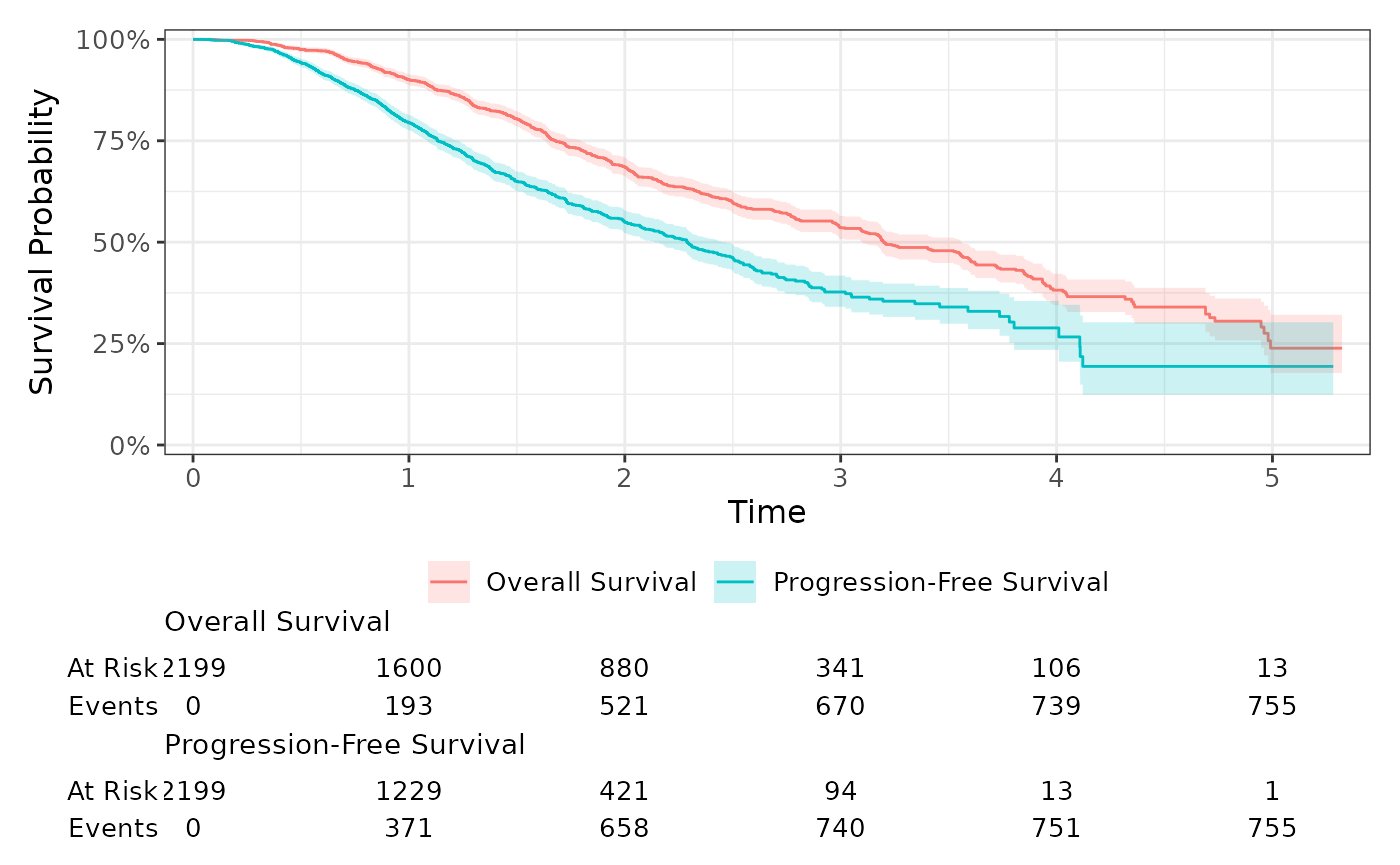
Swap Line Type & Color Aesthetics
By default, a model plot created with ggsurvfit() or
ggcuminc() uses the color aesthetic to plot curves by the
stratifying variable(s), and further, ggcuminc() uses the
linetype aesthetic for plots that contain multiple outcomes
(i.e. competing events). There is a global option
"ggsurvfit.switch-color-linetype" to switch these defaults,
giving users more flexibility over the output figures. Review
?ggsurvfit_options for details.
options("ggsurvfit.switch-color-linetype" = TRUE)

tidycmprsk::cuminc(Surv(ttdeath, death_cr) ~ 1, tidycmprsk::trial) %>%
  ggcuminc(outcome = c("death from cancer", "death other causes")) +
  add_risktable()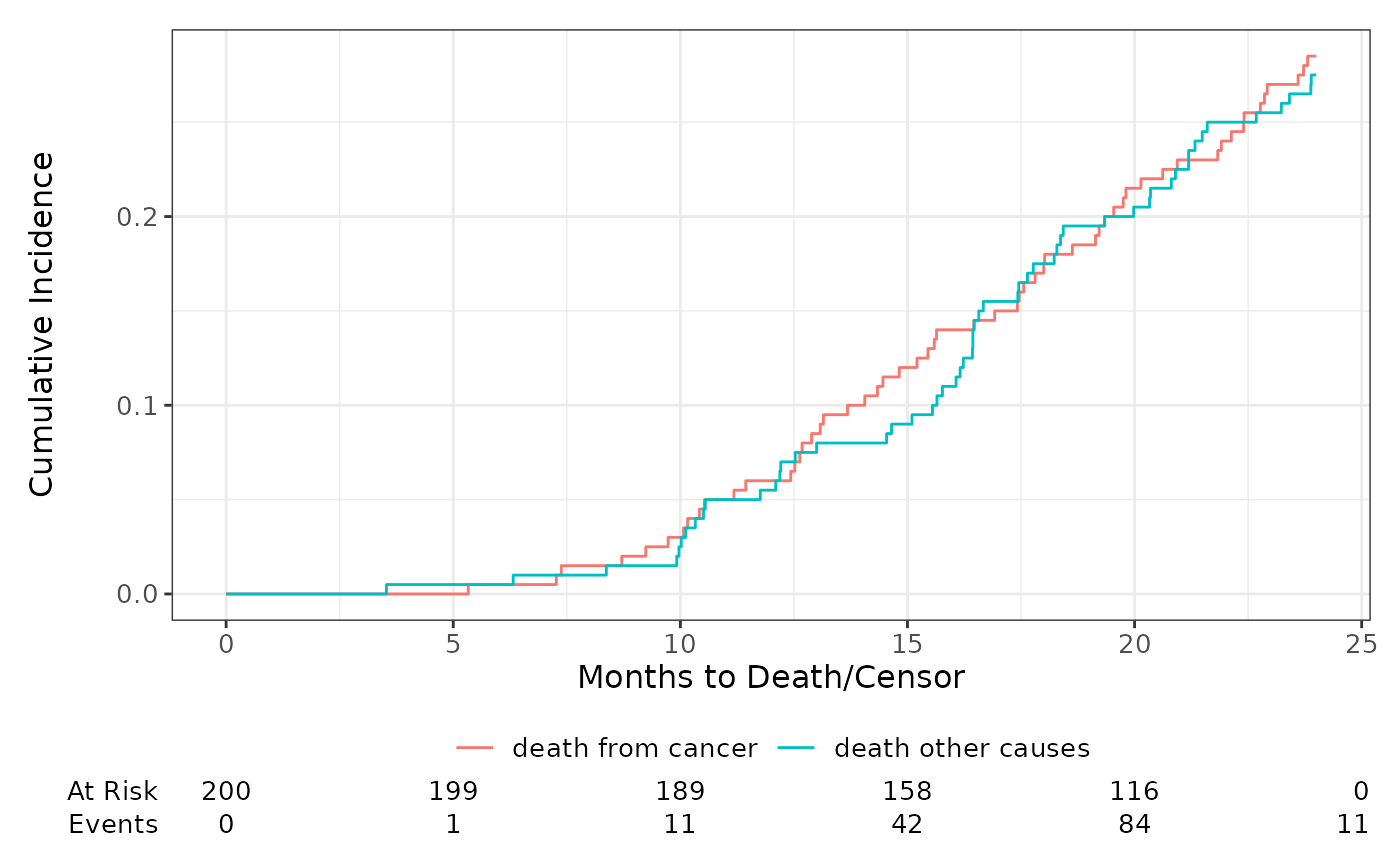
Check Proportional Hazards
The complementary log-log plot plots the logarithm of the negative logarithm of the estimated survivor function against the logarithm of survival time. If the hazards are proportional across groups, this plot will yield parallel curves.
survfit2(Surv(time, status) ~ sex, data = df_lung) %>%
  ggsurvfit(type = "cloglog") +
  scale_x_continuous(transform = "log")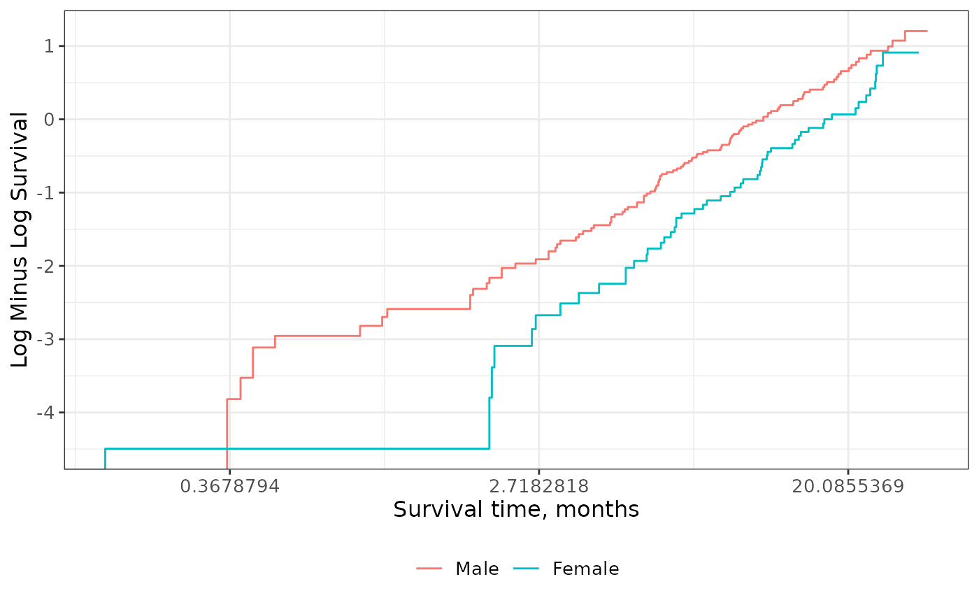
Adjusted Cox Models
The ggsurvfit supports printing adjusted Cox Proportion Hazards
Regression models. Any stratifying levels must be wrapped in a
strata() call in the RHS of the formula.
library(survival)

coxph(Surv(time, status) ~ age + strata(surg), data = df_colon) %>%
  survfit2() %>%
  ggsurvfit() +
  add_confidence_interval() +
  add_risktable() +
  scale_y_continuous(limits = c(0, 1))